“After learning about redlining, I can see it all around me now.”
Reading my student Lilliana’s words reminded me of my own experience encountering the history of redlining. I don’t remember when it was, but I remember what it felt like. Something in my head just clicked — the streets that seemed like an invisible barrier between Black and white, the stark differences I’d observed between cities and their surrounding suburbs — the racialized physical environments I had grown up in, lived in, and worked in, all suddenly made sense. Growing up I was told that the South was where you’d find segregation, where the legacy of racism shaped the fabric of social and political life. But I spent most of my life living in cities — Los Angeles; Portland, Oregon; New York City; Philadelphia — profoundly shaped by decades of racist redlining policies and practices.
Before working for Rethinking Schools, I taught African American history to sophomores at Central High School in Philadelphia, a uniquely diverse academic magnet school in one of the most segregated cities in the country. In fact, according to analysis of the 2020 Census, a majority of the top 10 most segregated cities and metropolitan areas in the country are outside of the South. And segregation was never only about the physical separation of people, but also the vast inequalities between different racial groups. Unless we teach the history of racist housing policies that have led to white people holding 10 times the wealth of Black people in the United States, students will be more susceptible to racist arguments that blame Black poverty on individual and cultural failings.
As I began crafting my unit on redlining, I wanted to figure out how to simulate the way decades of redlining practices led to segregation and dramatic wealth disparities. I knew from running lessons like Bill Bigelow’s Thingamabob Game (posted at the Zinn Education Project website) that when students experience an aspect of the political economy, they grasp the dynamics at work much clearer than they would otherwise. This was confirmed repeatedly by students in their end-of-unit reflections. “Having experienced it firsthand, my understanding is not only deeper but also more ingrained,” Anna wrote. Classroom simulations are often the lessons that stick with students — the ones they talk about at the end of the year and when they come back to visit after graduating. But figuring out exactly what facet of redlining I wanted to simulate was more complicated than I had anticipated.
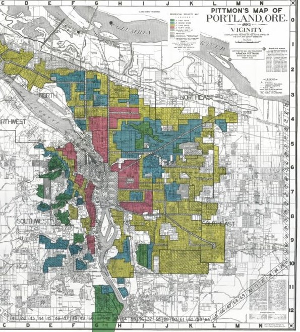
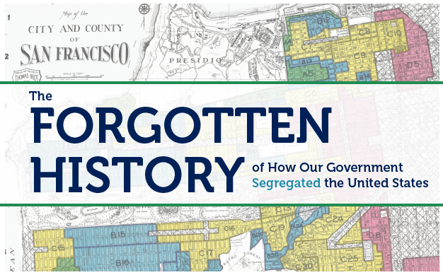
Redlining is now popularly associated with the maps created in the 1930s by the Home Owners’ Loan Corporation (HOLC), a New Deal-era government agency. These maps gave letter grades to neighborhoods in nearly 230 U.S. cities on a scale from “Best” (A) neighborhoods, assigned the color green; “Still Desirable” (B), assigned the color blue; “Definitely Declining” (C), assigned the color yellow; and “Hazardous” (D) neighborhoods, assigned the color red. Lower grades of C and D indicated to banks and investors that mortgages or investments in these areas would be risky. Investment poured into A and B areas and was almost universally withheld from C and D areas. But what the rating system really indicated was the race and class character of the neighborhoods — and the racism and classism of those who graded them. The racism of HOLC geographers was such that even solidly middle-class African American neighborhoods were labeled red.
Continue reading this lesson by Adam Sanchez at Rethinking Schools.


Twitter
Google plus
LinkedIn